Wednesday, July 30, 2008

CORRELATION MATRIX

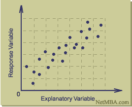
This is an image of a Correlation Matrix. A Correlation Matrix is a graphical representation of the correlation between two numeric variables.

This image is a Correlation Matrix of Strategic Objectives. The results from this matrix shows that firms focusing on creating shareholder value while also taking into account the needs of other stakeholders and employees, will achieve higher productivity. In summary, people matter and how they are managed and interact in the workplace is crucial to the productivity of any business. This matrix also shows that there are strong associations between stakeholder value, customer and market priorities, innovation and shareholder value.

GEOPOTENTIAL HEIGHT MAP

This is an image of a Geopotential Height Map, a type of contour map. Geopotential height approximates the actual height of a pressure surface above mean sea-level. Therefore, a geopotential height observation represents the height of the pressure surface on which the observation was taken. A line drawn on a weather map connecting points of equal height (in meters) is called a height contour. That means, at every point along a given contour, the values of geopotential height are the same.

This is an image depicting the geopotential height. The height contours are represented by the solid lines. The small numbers along the contours are labels which identify the value of a particular height contour (for example 5640 meters, 5580 meters, etc.).

PIE CHART

This is an image of a Pie Chart. Most of us are familiar with pie charts as they are a very popular type of geovisualization. The use of pie charts began a movement away from recording data into columns and rows like an accountant, thus initiating what is now today called geovisualization or cartographic visualization.

This image is a simple (and I think cute) illustration of a pie chart. It shows the results of how five different pies ranked. Is this close to your own ranking? Hmmm.

PLANIMETRIC MAP

This is an image of a black and white Planimetric Map. Planimetric maps are surface maps with no relief features. The information they show is two dimensional; therefore it is not a contour map as there is no three dimensional contrast shown.

This image is a Planimetric Map of Lake George, New York. It includes information such as historical locations and landmarks, some significant street names, marinas, churches. This is an especially helpful map to assist with local travel in that area.

DOT DENSITY MAP

This is an image of a Dot Density Map. Dot Density Maps uses nonproportional point symbols. The symbols do not vary in size and each dot (symbol) represents equal value. Dots can be nominally differentiated by varying the shapes or colors of the point symbols.

This Dot Density Map shows the Virginia School Districts with Public Schools.

PROPORTIONAL CIRCLE MAP

This is an image of a Proportional Circle Map. Proportional Circle Maps mark data with a circle (instead of a dot), where the size of the circle relates to the measured variable and not necessarily to the area over which it is measured. This particular map is considered a continuously graded proportional circle map, as the circles come in all sizes.

This map shows the population for a certain group. In this case the group is French, single responses, population by mother tongue 2006 – Provinces and Territories in Canada.

Tuesday, July 29, 2008

DOPPLER RADAR

This is an image showing Doppler Radar. Radar (radio detection and ranging) uses a transmitter to emit either radio or microwave radiation (in which case we call it Doppler) and a directional antenna to receive and measure the time of arrival of reflected pulses from distant objects.
Doppler is commonly used to make atmospheric profiles of clouds. This includes their motion and the composition of the particles in the air, particularly precipitation.

This map is from NOAA National Weather Service showing a Doppler Radar image in Houston, Texas, of Hurricane Claudette as it makes landfall on July 15, 2003. The various colors represent rain intensity levels.

FLOW MAP


This is an image of a flow map, which is a type of line map. Flow maps may show:

  • the actual path of entities across a surface and their intensity
  • idealized locations of the travel path. When path is idealized, type of flow map is desire line map. Shows only general direction, not actual path.

This image is a map of the 1998 Combined Commodity Truck Flows including both domestic and international truck flows. This map shows the combined domestic and international (including cargos moving to or from border crossings or ports) truck commodity flow. For most flows, the majority of total truck activities are local, either within the state or neighboring states. The long distance corridors are used by both domestic and international freight.

Saturday, July 26, 2008

ISOTACH MAP

This is an image of an Isotach Map. An Isotach Map is a contour map. Isotachs are the contour lines on a given surface that connect points with equal or constant wind speed.

This particular Isotach Map was used as a learning tool for students interested in Meteorology for courses related to teaching basic structure and development of midlatitude synoptic scale storms.

Friday, July 25, 2008

TRIANGULAR PLOT

This is an image of a Triangular Plot, which is a type of geovisualization. A Triangular Plot plots three distinct variables.

This Triangular Plot is an estimate of the probable outcome of the (British) election, based on 2005 opinion polls recorded on Anthony Well’s website. The axes of the figure show the estimated fraction of the population intending to vote for each of the major parties; the white circle shows the current estimate from opinion polls. The colored areas show the regions of the plot in which -- under the assumption of uniform national swing -- each of the corresponding major parties would win a majority in Parliament.

LORENZ CURVE (ACCUMULATIVE LINE GRAPH)

This is an image of a Lorenz Curve, which is a form of geovisualization. A Lorenz Curve is commonly used in economics and ecology to describe inequality in wealth or size. The Lorenz curve is a function of the cumulative proportion of ordered individuals mapped onto the corresponding cumulative proportion of their size.

This Lorenz Curve is an image found on The North Lanarkshire Council website, which reflects fairness in terms of income in Scotland. For example, if everyone in Scotland had an equal amount of money, we would have a Lorenz Curve like the Perfect Equality line where 10% of the population have 10% of the income, and so on. Complete inequality, where one person has all the money in Scotland, would be a straight line along the bottom of the graph.

LINE GRAPH

This is an image of a line graph, which is a type of geovisualization. Line graphs are commonly used to visualize activity in the stock market. This line graph shows the Dow Jones Industrial Average (DJIA) during a 20-year period from 1985 to 2005.

A line graph is like a scatter plot, except that its data points are connected by a line. Line graphs compare two variables. Each variable is plotted along an axis. A line graph has a vertical axis and a horizontal axis. Some of the strengths of line graphs are that:

  • They are good at showing specific values of data, meaning that given one variable the other can easily be determined.
  • They show trends in data clearly, meaning that they visibly show how one variable is affected by the other as it increases or decreases.
  • They enable the viewer to make predictions about the results of data not yet recorded.

SCATTER PLOT

This is an image of a Scatter Plot (or Scatter Graph). It is a type of geovisualization that displays values for two variables for a set of data. A scatter plot only specifies variables or independent variables when a variable exists that is under the control of the experimenter. The data is displayed as a collection of points, each having the value of one variable determining the position on the horizontal axis and the value of the other variable determining the position on the vertical axis.

This Scatter Plot was produced by Six Sigma. Six Sigma is a data-driven quality methodology for eliminating defects in any process, may it be in manufacturing or service organizations.

WIND ROSE


This image is an example of a Wind Rose, which is a type of geovisualization in the form of a circular plot. The winds are displayed in a form of concentric wedges, split into segments reflecting wind speed. The area of each segment is proportional to the total time of wind falling into specific speed/direction category.

This Wind Rose was produced by NOAA’s National Weather Service Weather Forecast office for Springfield, Missouri. In particular, it shows the average Wind Direction for Springfield in the month of March.

Thursday, July 24, 2008

STAR PLOT

This image is an example of a Star Plot of automobile data and includes 12 numeric variables in the automobile data. Each star represents one car model and each ray in the star is proportional to one variable.

Star Plots are a type of geovisualization that allow you to compare multiple variables for each observation. Each observation is represented as a star-shaped figure with one ray for each variable. A legend often accompanies a Star Plot to identify what the variables are and in what location (or on what ray) each variable is represented (though a legend is not provided in this blog).

HISTOGRAM


This is an image of a histogram. A histogram is a type of geovisualization that displays tabulated frequency. Each year the National Weather Service performs a validation of the summer time UV Index forecasts. This histogram records the all the differences between the observation sites and the forecasts. The histogram shows that 26% of the time the UV Index is exactly correct. 65% of the time the UV Index forecast is within ± 1 UV Index unit. And 84% of the time the UV Index is within ± 2 UV Index units.

INFRARED AERIAL PHOTO


This is an image of a 1995 infrared aerial photo of Lyndon B. Johnson (LBJ) Ranch in Gillespie County. Infrared (IR) emulsion is sensitive to wavelengths that fall outside the range of human vision. IR film is commonly used to produce color-infrared photos. IR imagery uses false color, since we can’t really see the wavelengths recorded on infrared film. Features that may have similar shades of grey in black and white aerial photos will be much more distinguishable with IR film.

Monday, July 21, 2008

BOX PLOT

This image is an example of a box plot. A box plot, or box and whisker diagram, provides a simple graphical summary of a set of data and is a standardized way of displaying the distribution of data based on the five number summary: minimum, first quartile, median, third quartile, and maximum. It shows a measure of central location the median), the average, and measures of dispersion. In the simplest box plot the central rectangle spans the first quartile to the third quartile (the interquartile range or IQR). A segment inside the rectangle shows the median and "whiskers" above and below the box show the locations of the minimum and maximum. Box plots are especially useful when comparing two or more sets of data.

CLIMOGRAPH

A climograph is a type of geovisualization. It is a graphic representation of the relation between temperature and precipitation as plotted at monthly intervals throughout the year. This image shows us the Wet-Dry Tropical / Tropical Savanna climate: Timbo, Guinea, at lat. 10N, West Africa. Looking at the map, we can see that a wet season at time of high sun alternates with an almost rainless dry season at time of low sun.

BLACK & WHITE AERIAL PHOTO

Aerial photographs are a type of remote sensing. In particular, the black and white mixture on an aerial photo is sensitive to approximately the same wavelengths as the human eye. This image is a black and white aerial photo of the University of Western Ontario (UWO) in 1930.

Wednesday, July 16, 2008

STEM AND LEAF PLOT

Stem-and-leaf plots are considered a geovisualization type map. They can tell you how the variable is distributed in the population. For example, this stem-and-leaf plot of student marks is fairly symmetric with short tails although there was also an outlier. To understand the values represented, you take the number to the left of the bar and place each value in the horizontal row next to that value. For example, the first row of numbers represented is: 90 and 96.

CHOROPLETH MAP

This image is a Choropleth map, which is the most common type of statistical map. Choropleth maps portray areal data. Areal divisions are often boundaries like census tracts, counties, states.

This map shows the amount of spending (in millions) by overseas residents in 2003, and it classifies the data into five intervals. Typically four to seven intervals are used, and this map is well within the standards of Choropleth maps.

Monday, July 14, 2008

INDEX VALUE PLOT

An index value plot is a geovisualization map that plots the departures relative to a given index value. This index value plot measures the average streamflow index. The average streamflow index, plotted as the red line on the above graph, is calculated each day as the average of the streamflow index values for all the stream gaging stations in the state or water source region having at least 30 years of record. The streamflow index value at a station compares the real-time streamflow value to historical values for the day of the year.