Sunday, August 3, 2008

TOPOGRAPHIC MAP

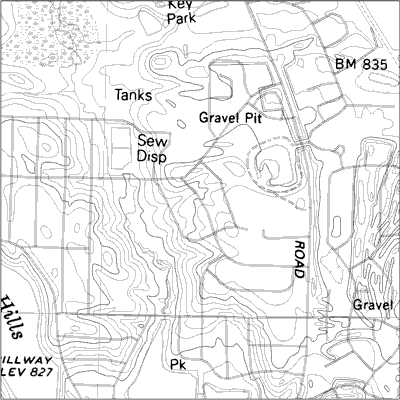
A Topographic Map is a type of map characterized by large-scale detail and quantitative representation of relief, usually using contour lines in modern mapping, but historically using a variety of methods. Traditional definitions require a topographic map to show both natural and man-made features.

This image is a Topographic Map of Romania showing the different elevations of this land. For those of us not familiar with Romania, listed below are a few interesting tidbits of information about Romania:
  • Romania is located in Southeastern Europe, bordering the Black Sea, between Bulgaria and Ukraine, comprising of 237,500 sq km.
  • Romania has a population of 22,329,977 (2005).

THEMATIC MAP

A Thematic Map shows the spatial distribution of one or more specific data themes for standard geographic areas. The map may be qualitative in nature (e.g., predominant farm types) or quantitative (e.g., percentage population change). In contrast to reference maps which show many geographic features (forests, roads, political boundaries), thematic maps emphasize spatial variation of one or a small number of geographic distributions.

This Thematic Maps shows the population percent change in the United States between 1990 and 1996. The source of the data is the USDC, Bureau of the Census.

UNSTANDARDIZED CHOROPLETH MAP

An Unstandardized Choropleth Map portrays areal data, and is not areally averaged in any way. The Areal divisions are often boundaries like census tracts, counties, states.

This Unstandardized Choropleth Map shows the acres of forage (hay, silage, etc.) The map is showing that the total hay or silage acres in each county is more regionally diffuse, since it proportionately favors the largest counties, notably those in central California, southeastern Oregon, and the northern Plains.

SIMILARITY MATRIX

A similarity matrix, a type of geovisualization, is a matrix of scores which express the similarity between two data points. Similarity matrices are used in sequence alignment. Higher scores are given to more-similar characters, and lower or negative scores for dissimilar characters.

This image is a similarity matrix of the song by the Beatles, “Hey Jude”. This Similarity Matrix was designed to show the repetition parts. Noted observations are:
  • The "deep blue" part along the off-diagonal lines of similarity matrix represents repeating parts.
  • The chorus is easier to detect from the similarity matrix than the verse.
  • The dissimilar part between very similar parts is usually instrument playing without vocal sounds.

STANDARDIZED CHOROPLETH MAP


A Standardized Choropleth map portrays areal data, and is areally averaged (i.e. Density-persons per square mile, percentages). The Areal divisions are often boundaries like census tracts, counties, states.

This Standardized Choropleth Map shows Canada – Percentage of Population Aged 14 and Under. The data used for this map is from the 2006 Census Data.

CONTINUOUSLY VARIABLE PROPORTIONAL CIRCLE MAP

A Continuously Variable Proportional Circle Map is a proportional circle map, where we point data mapped with a circle instead of a dot, and there are not a finite or set number of sizes used for the circles. The circles can come in all sizes.

This image is a map Continuously Variable Proportional Circle Map of the 2002 Gorilla Groups Locations in Uganda. Each circle represents one group, with the size of the circle proportional to the size of the group.

RANGE-GRADED PROPORTIONAL CIRCLE MAP

A Range-Graded Proportional Circle Map is a proportional circle map, where we point data mapped with a circle instead of a dot, and there are a finite or set number of sizes used for the circles.

This image is a map Range-Graded Proportional Circle Map of Filipino Population for selected states in the year 2000. The data comes from the 2000 Census Bureau.

DLG (Digital Line Grap)

DLGs (Digital Line Graphs) are digital vector representations of topographic and planimetric map features derived from either aerial photographs or from cartographic source materials such as USGS maps ad related sources, using manual and automated digitizing methods.

This image is a Digital Line Graph (DLG) with raster text scanned from mylar separate. Separate feature layers allow for selection or omission of map features, and the vector data provides high quality line work for publication of geological maps.

CARTOGRAM

A cartogram is a map in which some thematic mapping variable – such as travel time or Gross National Product – is substituted for land area. The geometry or space of the map is distorted in order to convey the information of this alternate variable. There are two main types of cartograms: area and distance cartograms.

This is an image of the World economy cartogram. To highlight the distribution of wealth and power in the world of today, this cartogram sizes the countries according to their relative financial status, here presented through gross domestic product (gdp) per capita, offering an alternative world view to a regular map. Countries such as China and India become much smaller, next to giants in Western Europe, North America and Japan. Africa represents a minor speck, while South and Central America lands somewhere in between.

BATHYMETRIC MAP

A Bathymetric Map is a map that accurately depicts all of the various depths of a water body. A bathymetric map or chart usually shows floor relief or terrain as contour lines (called depth contours or isobaths), and may additionally provide surface navigational information. Color-coding to show the different depths of water is a common methodology used in bathymetric maps.

This image is a Bathymetric map of Lake Tahoe CA/NV. In this image, areas where the bottom is visible are colored red and green (greater bottom reflectance is shown in red). Where the lake is blue the bottom cannot be seen. The depth to which the bottom is visible varies depending on the clarity of the water.

Saturday, August 2, 2008

DEM (Digital Elevation Model) MAP

A digital elevation model (DEM) is a digital representation of ground surface topography or terrain. A DEM can be represented as a raster (a grid of squares) or as a triangular irregular network. DEMs are commonly built using remote sensing techniques, however, they may also be built from land surveying. DEMs are used often in geographic information systems, and are the most common basis for digitally-produced relief maps.

This image is a Digital elevation Model of the Hartnett Study Site. It displays the topography of the Hartnett study site in three dimensions. The model was created by digitizing a georeferenced DRG (Digital Raster Graphic) in Arcview GIS.

METES AND BOUNDS SURVEY MAP

The most well known unsystematic cadastral method for surveying land is metes and bounds. It is no longer practiced, but much of the US was initially surveyed in metes and bounds. Metes are units of distance and bounds (names of markers) are used to divide up land according to ownership. Since there is typically a strong reliance on landscape features, which could and often did change, move or no longer exist over time, this survey method was considered very problematic.

This image is an example of a Metes and Bounds Survey Map. The metes given are 45° southwest, 30 chains. A chain is a unit of measurement sixty-six feet long. There are eighty chains to the mile. The bound is the felled maple.

SYSTEMATIC PUBLIC LAND SURVEY SYSTEM

The Public Land Survey System (PLSS) is used to divide public domain lands, which are lands owned by the Federal government for the benefit of the citizens of the United States. The PLSS typically divides land into 6-mile-square townships, which is the level of information included in the National Atlas. Townships are subdivided into 36 one-mile- square sections. Sections can be further subdivided into quarter sections, quarter-quarter sections, or irregular government lots. Normally, a permanent monument, or marker, is placed at each section corner. The PLSS is a good example of a systematic land partitioning (cadastral) system. The reason this map is considered “systematic” is because the sections are divided using a systematic methodology.

This data for this systematic public land survey system shows the township, range, and sections for the majority of the state of Indiana, with a small gap in northeast Indiana.

CADASTRAL MAP

A cadastral map is a map showing the boundaries and ownership of land parcels. Some cadastral maps show additional details, such as survey district names, unique identifying numbers for parcels, certificate of title numbers, positions of existing structures, section and/or lot numbers and their respective areas, adjoining and adjacent street names, selected boundary dimensions and references to prior maps.

This particular Cadastral Map is an image of Agricultural fields near Campobasso – Italy.

NOMINAL AREA CHOROPLETH MAP


This is an image of a Nominal Area Choropleth Map. This map is nominal because there is no implicit ordering of groupings; it is a qualitative classification of groups.

This image is a political map of Africa. There is no particular hierarchy or order of the political affiliations represented on this map; therefore it is considered nominal.

UNCLASSIFIED CHOROPLETH MAP

In an Unclassified Choropleth Map the numeric attribute values are converted directly into proportional degrees of darkness, i.e. the higher the object's attribute value, the darker the shade representing it.

This Unclassified Choropleth Map shows the fertility rate attribute values for countries in Europe. The maximum fertility rate is 2.27 children born per woman in Albania and is represented by the darkest shade of orange and the minimum fertility rate is 1.13 children born per woman in Bulgaria represented by the lightest shade of orange.

CLASSED CHOROPLETH MAP

In a Classed Choropleth Map, areal units are combined into a smaller number of groups and portrayed in intervals.

This Classed Choropleth Map shows the percent of people who are Hispanic per county in Florida based on Census data from 2000. This image’s areal unit is the county, and there are five, natural break, classification intervals. That means the groups are divided into unequally sized groups that attempt to group like data together.

UNIVARIATE CHOROPLETH MAP

This is an image of a Univariate Choropleth Map, which is also known as a thematic map. This univariate Choropleth map displays the spatial distribution of an attribute that relates to a single topic, theme, or subject of discourse. More specifically, this image represents the population density in a given area.

DRG (Digital Raster Graphics)

This is an image of a DRG, which is a digital raster graphic. A digital raster graphic (DRG) is a scanned image of a U.S. Geological Survey (USGS) standard series topographic map, including all map collar information. The image inside the map neatline is georeferenced to the surface of the earth. The horizontal positional accuracy and datum of the DRG matches the accuracy and datum of the source map. The map is scanned at a minimum resolution of 250 dots per inch.

This map is a part of the Washington West, D.C. Digital Raster Graphic (DRG).

MENTAL MAP

Mental maps are an individual's internalized representation (a person’s point of view) of some aspects of the Earth's surface. It represents what the person knows about the locations and the characteristics of places at a variety of scales (local to global) from the layout of the one's bedroom to the distribution of oceans and continents on the surface of the Earth.

This image is a Mental map of the West part of the United States. The person who created the map based this map on what he perceived the West to be, as someone who has lived in Colorado and Arizona his whole life and had traveled extensively throughout the region.

PARALLEL COORDINATE GRAPH

Parallel coordinate plots are a type of geovisualization that can be used to explore relationships among variables by plotting large multivariate datasets. A parallel coordinate graph is used to plot large multivariate datasets. Each variable in the data plot is represented as its own Y Axis on the graph. A maximum point for each Y axis is selected, and they are scaled relatively to each other so that each variable takes up the same area in the graph space. The strength of parallel coordinates isn't in their ability to communicate some truth in the data to others, but rather in their ability to bring meaningful multivariate patterns and comparisons to light when used interactively for analysis.

This image is a Parallel Coordinate Graph of Baseball statistics. For example, each Y Axis is labeled with a particular baseball statistic (i.e. Homeruns, RBIs, etc). The value labeled at the top of each Y axis represents the player with the highest value in that category. A scaling factor is applied to the y value in an (x,y) point, so that all of the statistics are relative in value to each other in the graph. Each line drawn represents a single player. More precisely, a line is represented by the values of each of a player's statistics.

Wednesday, July 30, 2008

CORRELATION MATRIX

This is an image of a Correlation Matrix. A Correlation Matrix is a graphical representation of the correlation between two numeric variables.

This image is a Correlation Matrix of Strategic Objectives. The results from this matrix shows that firms focusing on creating shareholder value while also taking into account the needs of other stakeholders and employees, will achieve higher productivity. In summary, people matter and how they are managed and interact in the workplace is crucial to the productivity of any business. This matrix also shows that there are strong associations between stakeholder value, customer and market priorities, innovation and shareholder value.

GEOPOTENTIAL HEIGHT MAP

This is an image of a Geopotential Height Map, a type of contour map. Geopotential height approximates the actual height of a pressure surface above mean sea-level. Therefore, a geopotential height observation represents the height of the pressure surface on which the observation was taken. A line drawn on a weather map connecting points of equal height (in meters) is called a height contour. That means, at every point along a given contour, the values of geopotential height are the same.

This is an image depicting the geopotential height. The height contours are represented by the solid lines. The small numbers along the contours are labels which identify the value of a particular height contour (for example 5640 meters, 5580 meters, etc.).

PIE CHART

This is an image of a Pie Chart. Most of us are familiar with pie charts as they are a very popular type of geovisualization. The use of pie charts began a movement away from recording data into columns and rows like an accountant, thus initiating what is now today called geovisualization or cartographic visualization.

This image is a simple (and I think cute) illustration of a pie chart. It shows the results of how five different pies ranked. Is this close to your own ranking? Hmmm.

PLANIMETRIC MAP

This is an image of a black and white Planimetric Map. Planimetric maps are surface maps with no relief features. The information they show is two dimensional; therefore it is not a contour map as there is no three dimensional contrast shown.

This image is a Planimetric Map of Lake George, New York. It includes information such as historical locations and landmarks, some significant street names, marinas, churches. This is an especially helpful map to assist with local travel in that area.

DOT DENSITY MAP

This is an image of a Dot Density Map. Dot Density Maps uses nonproportional point symbols. The symbols do not vary in size and each dot (symbol) represents equal value. Dots can be nominally differentiated by varying the shapes or colors of the point symbols.

This Dot Density Map shows the Virginia School Districts with Public Schools.

PROPORTIONAL CIRCLE MAP

This is an image of a Proportional Circle Map. Proportional Circle Maps mark data with a circle (instead of a dot), where the size of the circle relates to the measured variable and not necessarily to the area over which it is measured. This particular map is considered a continuously graded proportional circle map, as the circles come in all sizes.

This map shows the population for a certain group. In this case the group is French, single responses, population by mother tongue 2006 – Provinces and Territories in Canada.

Tuesday, July 29, 2008

DOPPLER RADAR

This is an image showing Doppler Radar. Radar (radio detection and ranging) uses a transmitter to emit either radio or microwave radiation (in which case we call it Doppler) and a directional antenna to receive and measure the time of arrival of reflected pulses from distant objects.
Doppler is commonly used to make atmospheric profiles of clouds. This includes their motion and the composition of the particles in the air, particularly precipitation.

This map is from NOAA National Weather Service showing a Doppler Radar image in Houston, Texas, of Hurricane Claudette as it makes landfall on July 15, 2003. The various colors represent rain intensity levels.

FLOW MAP


This is an image of a flow map, which is a type of line map. Flow maps may show:

  • the actual path of entities across a surface and their intensity
  • idealized locations of the travel path. When path is idealized, type of flow map is desire line map. Shows only general direction, not actual path.

This image is a map of the 1998 Combined Commodity Truck Flows including both domestic and international truck flows. This map shows the combined domestic and international (including cargos moving to or from border crossings or ports) truck commodity flow. For most flows, the majority of total truck activities are local, either within the state or neighboring states. The long distance corridors are used by both domestic and international freight.

Saturday, July 26, 2008

ISOTACH MAP

This is an image of an Isotach Map. An Isotach Map is a contour map. Isotachs are the contour lines on a given surface that connect points with equal or constant wind speed.

This particular Isotach Map was used as a learning tool for students interested in Meteorology for courses related to teaching basic structure and development of midlatitude synoptic scale storms.

Friday, July 25, 2008

TRIANGULAR PLOT

This is an image of a Triangular Plot, which is a type of geovisualization. A Triangular Plot plots three distinct variables.

This Triangular Plot is an estimate of the probable outcome of the (British) election, based on 2005 opinion polls recorded on Anthony Well’s website. The axes of the figure show the estimated fraction of the population intending to vote for each of the major parties; the white circle shows the current estimate from opinion polls. The colored areas show the regions of the plot in which -- under the assumption of uniform national swing -- each of the corresponding major parties would win a majority in Parliament.

LORENZ CURVE (ACCUMULATIVE LINE GRAPH)

This is an image of a Lorenz Curve, which is a form of geovisualization. A Lorenz Curve is commonly used in economics and ecology to describe inequality in wealth or size. The Lorenz curve is a function of the cumulative proportion of ordered individuals mapped onto the corresponding cumulative proportion of their size.

This Lorenz Curve is an image found on The North Lanarkshire Council website, which reflects fairness in terms of income in Scotland. For example, if everyone in Scotland had an equal amount of money, we would have a Lorenz Curve like the Perfect Equality line where 10% of the population have 10% of the income, and so on. Complete inequality, where one person has all the money in Scotland, would be a straight line along the bottom of the graph.

LINE GRAPH

This is an image of a line graph, which is a type of geovisualization. Line graphs are commonly used to visualize activity in the stock market. This line graph shows the Dow Jones Industrial Average (DJIA) during a 20-year period from 1985 to 2005.

A line graph is like a scatter plot, except that its data points are connected by a line. Line graphs compare two variables. Each variable is plotted along an axis. A line graph has a vertical axis and a horizontal axis. Some of the strengths of line graphs are that:

  • They are good at showing specific values of data, meaning that given one variable the other can easily be determined.
  • They show trends in data clearly, meaning that they visibly show how one variable is affected by the other as it increases or decreases.
  • They enable the viewer to make predictions about the results of data not yet recorded.

SCATTER PLOT

This is an image of a Scatter Plot (or Scatter Graph). It is a type of geovisualization that displays values for two variables for a set of data. A scatter plot only specifies variables or independent variables when a variable exists that is under the control of the experimenter. The data is displayed as a collection of points, each having the value of one variable determining the position on the horizontal axis and the value of the other variable determining the position on the vertical axis.

This Scatter Plot was produced by Six Sigma. Six Sigma is a data-driven quality methodology for eliminating defects in any process, may it be in manufacturing or service organizations.

WIND ROSE


This image is an example of a Wind Rose, which is a type of geovisualization in the form of a circular plot. The winds are displayed in a form of concentric wedges, split into segments reflecting wind speed. The area of each segment is proportional to the total time of wind falling into specific speed/direction category.

This Wind Rose was produced by NOAA’s National Weather Service Weather Forecast office for Springfield, Missouri. In particular, it shows the average Wind Direction for Springfield in the month of March.

Thursday, July 24, 2008

STAR PLOT

This image is an example of a Star Plot of automobile data and includes 12 numeric variables in the automobile data. Each star represents one car model and each ray in the star is proportional to one variable.

Star Plots are a type of geovisualization that allow you to compare multiple variables for each observation. Each observation is represented as a star-shaped figure with one ray for each variable. A legend often accompanies a Star Plot to identify what the variables are and in what location (or on what ray) each variable is represented (though a legend is not provided in this blog).

HISTOGRAM


This is an image of a histogram. A histogram is a type of geovisualization that displays tabulated frequency. Each year the National Weather Service performs a validation of the summer time UV Index forecasts. This histogram records the all the differences between the observation sites and the forecasts. The histogram shows that 26% of the time the UV Index is exactly correct. 65% of the time the UV Index forecast is within ± 1 UV Index unit. And 84% of the time the UV Index is within ± 2 UV Index units.

INFRARED AERIAL PHOTO


This is an image of a 1995 infrared aerial photo of Lyndon B. Johnson (LBJ) Ranch in Gillespie County. Infrared (IR) emulsion is sensitive to wavelengths that fall outside the range of human vision. IR film is commonly used to produce color-infrared photos. IR imagery uses false color, since we can’t really see the wavelengths recorded on infrared film. Features that may have similar shades of grey in black and white aerial photos will be much more distinguishable with IR film.

Monday, July 21, 2008

BOX PLOT

This image is an example of a box plot. A box plot, or box and whisker diagram, provides a simple graphical summary of a set of data and is a standardized way of displaying the distribution of data based on the five number summary: minimum, first quartile, median, third quartile, and maximum. It shows a measure of central location the median), the average, and measures of dispersion. In the simplest box plot the central rectangle spans the first quartile to the third quartile (the interquartile range or IQR). A segment inside the rectangle shows the median and "whiskers" above and below the box show the locations of the minimum and maximum. Box plots are especially useful when comparing two or more sets of data.

CLIMOGRAPH

A climograph is a type of geovisualization. It is a graphic representation of the relation between temperature and precipitation as plotted at monthly intervals throughout the year. This image shows us the Wet-Dry Tropical / Tropical Savanna climate: Timbo, Guinea, at lat. 10N, West Africa. Looking at the map, we can see that a wet season at time of high sun alternates with an almost rainless dry season at time of low sun.

BLACK & WHITE AERIAL PHOTO

Aerial photographs are a type of remote sensing. In particular, the black and white mixture on an aerial photo is sensitive to approximately the same wavelengths as the human eye. This image is a black and white aerial photo of the University of Western Ontario (UWO) in 1930.

Wednesday, July 16, 2008

STEM AND LEAF PLOT

Stem-and-leaf plots are considered a geovisualization type map. They can tell you how the variable is distributed in the population. For example, this stem-and-leaf plot of student marks is fairly symmetric with short tails although there was also an outlier. To understand the values represented, you take the number to the left of the bar and place each value in the horizontal row next to that value. For example, the first row of numbers represented is: 90 and 96.

CHOROPLETH MAP

This image is a Choropleth map, which is the most common type of statistical map. Choropleth maps portray areal data. Areal divisions are often boundaries like census tracts, counties, states.

This map shows the amount of spending (in millions) by overseas residents in 2003, and it classifies the data into five intervals. Typically four to seven intervals are used, and this map is well within the standards of Choropleth maps.

Monday, July 14, 2008

INDEX VALUE PLOT

An index value plot is a geovisualization map that plots the departures relative to a given index value. This index value plot measures the average streamflow index. The average streamflow index, plotted as the red line on the above graph, is calculated each day as the average of the streamflow index values for all the stream gaging stations in the state or water source region having at least 30 years of record. The streamflow index value at a station compares the real-time streamflow value to historical values for the day of the year.

Saturday, June 28, 2008

ISOHYET MAP


This image is an example of an Isohyet map. This map represents the rainfall distribution of Sabah. An Isohyet map is a contour map that measures rainfall. The definition of the word Isohyet is a line drawn on a weather map connecting points that receive equal amounts of precipitation during a given period of time.

Wednesday, June 25, 2008

LIDAR MAP


This image is an example of a LIDAR map (also known as Light Detection and Ranging). LIDAR, a type of remote sensing, is a process of scanning the earth with lasers from an aircraft to obtain accurate elevations. LIDAR is similar to sonar in that it measures distance by the time it takes for the laser to reach the ground and bounce back to the aircraft.

ISOBAR MAP

This is an Isobar Map from the Bureau of Meteorology, Australia. Isobar maps are a form of contouring map. A lines connecting points of equal pressure is called an isobar. That means, that at every point along a given isobar, the values of pressure are the same.

Contouring lines:
  • are used to represent three dimensional surfaces of the world on a flat map.
  • are imagery lines that join equal values of whatever is being mapped.

REMOTE SENSING - ORBITAL SATELLITES IMAGE


This map is a remote sensory image of orbital satellites in .KML format viewed using Google Earth. This view is limited to the North and South Carolina area, but on Google Earth you can zoom in or out on the image to see different orbital satellite views. You can even go so far as to see the orbital satellite image of the entire earth (though the view is not nearly as clear).

For those of you that are unfamiliar with remote sensing imagery, remote sensing is defined as a measurement of an object's characteristics from a distance using reflected or emitted electromagnetic energy. In more simple terms, remote sensing is the collection of data without directly measuring the object.

Tuesday, June 24, 2008

PLSS MAP


A PLSS (Public Land Survey System) map is a non-coordinate systematic map. This PLSS Map is a map of Franklin County, Alabama that shows townships and ranges. Townships are the north-south zones and Ranges are the east-west zones. Each section is equally divided, and the intersection of a township and range is called a congressional township.

STATISTICAL MAP


This is a statistical map. A statistical map is a type of map that communicate relative scaling of map properties, such as distances that are relative to properties other than physical distance. This map represents Napoleon's Russian Campaign of 1812. The size of Napoleon’s army is shown by the width of the lines of advance (green) and retreat (gold). The retreat information is correlated with a temperature scale shown along the lower portion of the map. This map was published by Charles Minard in 1869.